Article · Tools
Pen types and nibs, sorted out
The pen decides the shape of the line before your hand does. Knowing which family of pen makes which kind of mark saves a lot of guessing in the first month.
Article · Tools
The pen decides the shape of the line before your hand does. Knowing which family of pen makes which kind of mark saves a lot of guessing in the first month.
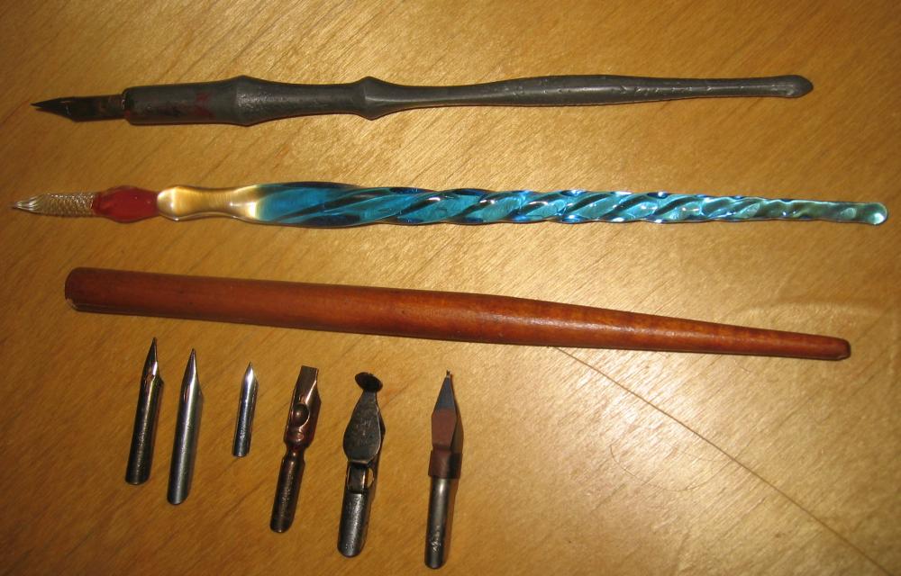
Most beginner tutorials, kits and class supply lists circle around four kinds of writing tool. They are not interchangeable, and trying to force one to behave like another is a common early frustration.
| Pen family | How the line is made | Typical first use |
|---|---|---|
| Broad-edge (dip) | A flat metal edge gives thick and thin strokes by direction, not pressure | Foundational hand, italic, blackletter |
| Pointed (dip) | A flexible tip spreads under pressure to swell the downstroke | Copperplate, modern pointed-pen scripts |
| Fountain pen | Built-in ink supply; usually a fixed round or italic tip | Everyday practice and italic handwriting |
| Brush pen | A flexible felt or bristle tip varies width with pressure | Modern brush lettering |
A broad-edge nib has a flat front edge. You hold it at a steady angle and the contrast between thick and thin comes from the direction you move, not from how hard you press. This is the tool behind classical scripts such as the foundational hand and italic. Many people start here because the angle teaches discipline early.
A pointed nib has two tines that separate under pressure. Press on the downstroke and the line swells; lift on the upstroke and it thins to a hairline. This pressure-based contrast is what gives copperplate and many modern scripts their swelling strokes. It is more sensitive to hand pressure, which is why some teachers suggest it after broad-edge work.
On nib widths. Broad-edge guideline heights are usually measured in nib-widths rather than millimetres, so the same alphabet scales with whatever nib you fit. A common starting ratio sets the x-height at about four nib-widths.
Fountain pens carry their own ink, so there is no dipping rhythm to manage. Models with an italic or stub tip produce gentle stroke contrast and are a practical bridge between everyday handwriting and formal calligraphy. They travel well and are forgiving for daily drills.
Brush pens behave like a pointed pen in that pressure controls width, but the flexible tip adds bounce and a looser line. They are central to modern brush lettering. Firmer small-tip brush pens are easier to control at first than large, very flexible ones.
Dedicated calligraphy supplies are easiest to find through dedicated art and stationery shops and their Canadian online stores; general craft chains stock a narrower range, often weighted toward brush pens. If you order specialist dip nibs from abroad, factor in shipping times and possible customs handling so a single broken nib does not stall practice. Buying two of each nib size at the start is a cheap hedge, since dip nibs are consumable and bend over time.
If you are unsure where to begin, a single broad-edge fountain pen plus a smooth practice pad lets you work on letterforms without the dipping routine, then move to dip nibs once the alphabet feels familiar.